Our Heroes – Moana pioneers shifting mindsets and creating space
Tai Paitai reflects on people, places and a particular time in his life, post the Homosexual Law Reform Bill.
Free museum entry for New Zealanders and people living in New Zealand
Open every day 10am-6pm
(except Christmas Day)
Free museum entry for New Zealanders and people living in New Zealand
Peter Roband was a graphic designer in Auckland in the 1990s. He volunteered to help design branding and collateral for the 1993 and 1994 Hero festivals, including the programme covers.
In this interview with Te Papa history curator Stephanie Gibson, Peter looks back fondly and proudly at the intense work and fruitful collaborations to create the programmes for Hero in a pre-digital age. He also recalls some of the tensions behind the scenes.
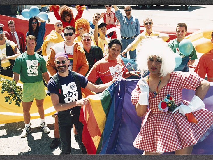
Auckland’s annual Hero festival ran from 1992 to 2001 and featured a flamboyant street parade, dance parties, and performances throughout the city. Hero intended to commemorate the heroes who were fighting against AIDS, and boost the LGBTQI+ community’s pride and health. The festivals drew huge crowds and were vibrant and safe places to publicly express identity and sexuality, and were welcoming to all.
Festival programmes were published most years detailing the events and including topical articles. The look and feel of each programme was determined by a group of designers and enthusiasts, who gave many hours of voluntary labour to create the branding and collateral needed for the festival each year, including posters, programmes, and printed T-shirts and singlets.
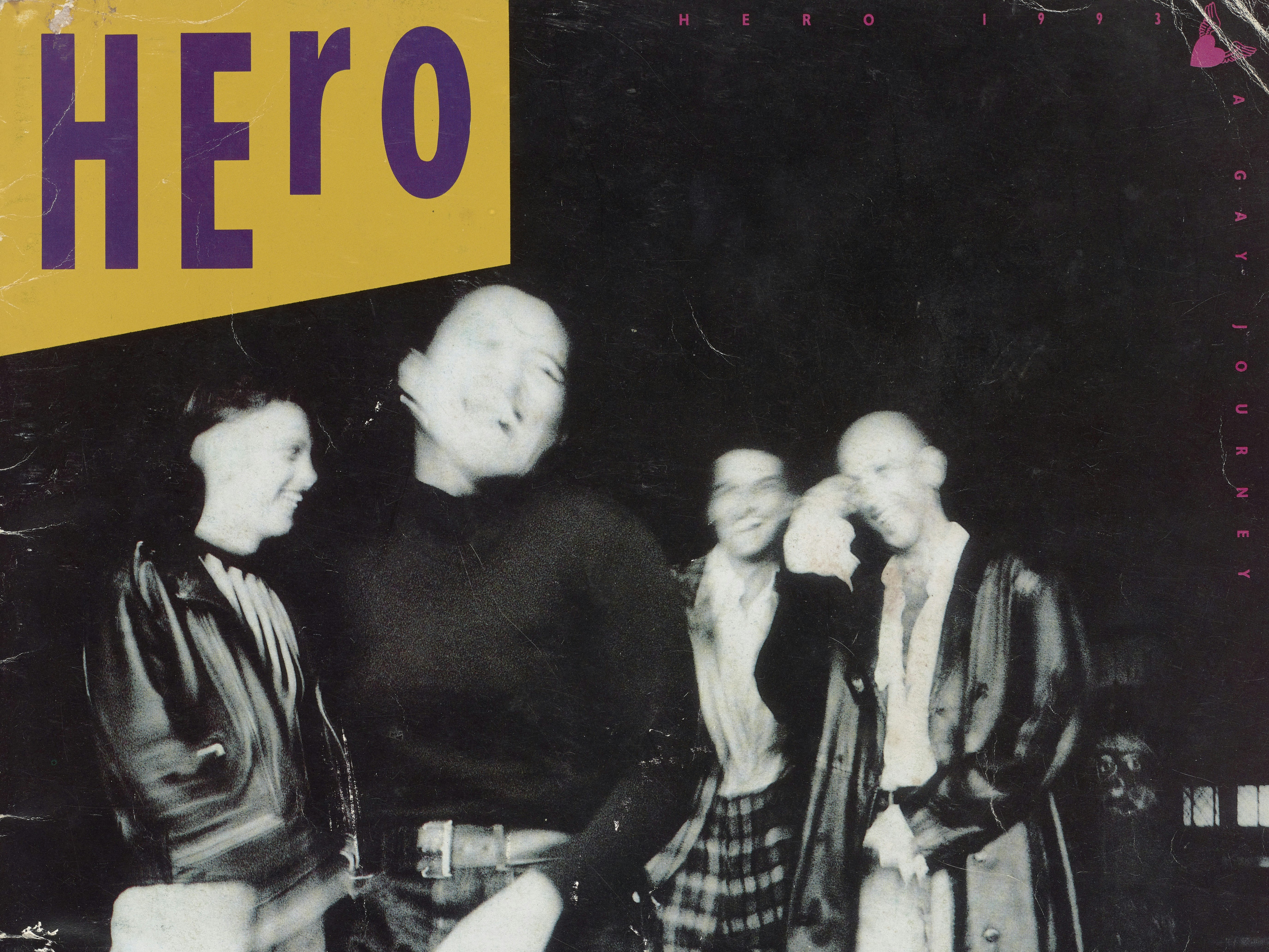
Hero programme, 1993, photograph by Mark Smith, cover designed by Peter Roband, published by The HERO Project Limited, New Zealand. Gift of Te Herekiekie Herewini, 2011. Te Papa (CA001013/001/0002)
For the 1993 Hero, the Hero board worked with Bruce Petry to develop the festival’s look and feel.
‘They wanted Hero to be inclusive and not just about men – hence the photograph has two men and two women,’ graphic designer Peter Roband recalls. ‘They signed up four people to model and get dressed up – it was a lot of fun.’
Petry co-ordinated the project, with Peter Roband designing the brand and cover for the programme, which features Mark Smith’s striking photograph of two men and two women out on the town for the night. Peter’s typography cleverly achieves inclusion by highlighting ‘He’ in Hero in one corner and ‘Her’ in Hero in the opposite corner.
However, ‘there was tension at board level – we presented a concept to the board but they wanted options – they wanted more than a single concept,’ Roband says. ‘But people weren’t getting paid! There was always a bit of tension working for nothing. And tension between a practising profession and quasi-semi-professional nature of Hero. 99% of Hero was voluntary.’
The final design ‘marks a moment in time – the community as it was back then – warts and all. It was really fun, really cool.’
Hero programme, 1994, New Zealand, by The HERO Project Limited, Mr Mark Smith, Deborah Smith, Mr Adam Petry, Mr Mark Summerville, Mr Gerrard Malcolm, Mr Peter Roband, Cox & Dawes Ltd. Gift of Peter Roband, 2020. Te Papa (GH025638)
For the 1994 Hero programme, Gerrard Malcolm was in charge of production and brought together Peter Roband, Mark Summerville, and Adam Petry as designers. Not all of them came from the profession – Petry was a jeweller and craftsperson. But they were all needed in the ‘pre-Apple Mac days’ when design was all manual paste-up work. Peter remembers ‘it was very exciting’. ‘The process of the two years I was involved was kind of an amateur collaboration exercise,’ he says. ‘These were analogue days – we spent 50-100 hours at the office at nights.’
A separate editorial team pulled together the content for the magazine, commissioning writers, etc. The editorial team had a month to work on content whereas the production team only had a weekend to design and produce the paper.
‘We worked all weekend in Gerrard’s office,’ Peter says. ‘There were galleys of type for manual typesetting, and scalpels. It’s a miracle anything got produced! It was such a manual process. Pencil tracings and sketches of photos to determine placement and crop. Placing all the ads. The first draft was produced over the course of a weekend. Then proofing and correcting on Sunday and Monday, and sent to the printer on Tuesday. The printer made film negatives then plates for printing.
‘It was wonderful – all the guys working on the magazine were delightful – it felt like a lovely collaborative effort. It was fun. It felt like we had a cause – something for the community. It wasn’t just putting a paper together. We worked hard, it was messy, untidy, but we divided and conquered!’
The paper had a big launch at the Watershed Theatre on the Auckland waterfront. But only the editorial team was thanked, not the designers.
‘The A2 size of the Hero paper was contentious,’ Peter says. ‘It was printed on newsprint. We called it a paper. It was almost the size of the Herald. A lot of people couldn’t quite cope with the huge format. It was meant to be this big positive expression of the community. It was quite heroic! But not completely understood.
‘Gay men and lesbian women were hardcore fighting their camps. There was tension between gay men and lesbians. The Hero Project was where we could come together. But a lot of gay men wanted something saucier – they didn’t necessarily want to share it! The paper celebrated gay and lesbian but it came under fire for straddling both.’
The cover image was ‘un-ignorable with flowers on the cover’:
‘The cover of 1994 is a reflection of the spirit of the design team – we were full of colour, positive-ness, and we believed in what we were doing,’ Peter says. ‘Each one was just like the cover. It felt like something we were giving the community – optimistic, positive, and bright.’
This marked the end of Peter’s involvement in designing for Hero – ‘I’d done my dash.’
Peter came back to New Zealand from Europe in the late 1980s. As a gay man in his early 30s, he thought that getting involved in Hero would be ‘a nice way to meet people’ – and he did. ‘I met my tribe and made enduring friendships,’ he says. ‘I remember having dinner with the guys and thinking ‘well, that worked!’ There was a whole tribe of us – we used to go to every Hero together.
‘Hero was one of the most wonderful things to work on. In my industry, it’s really, really easy to be involved in the present and forget about where you’ve been. It was an interesting time of life, becoming part of the fabric of the community by contributing to it, by working in it. When you need it, you get something back.’

Tai Paitai reflects on people, places and a particular time in his life, post the Homosexual Law Reform Bill.

Historian Will Hansen explores the origins of pride in Aotearoa New Zealand, and documents tensions between celebration and protest, and at times, the necessity for both.

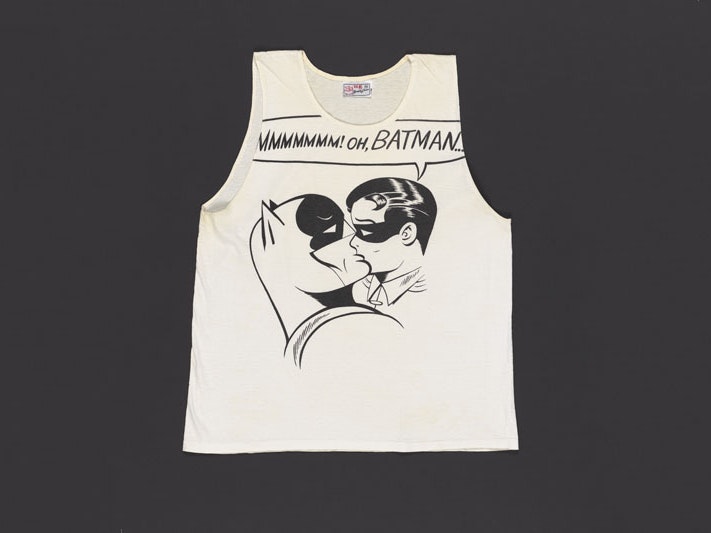
‘We all wear masks.’ Poet Chris Tse looks into the hidden (and not-so-hidden) subtexts of comic books, and shares the role superheroes – particularly Catwoman in Batman Returns – played in his own journey.